Compawnion

Pet adoption that fits your life.

A mobile app that helps first-time adopters find the right shelter animal, by honestly mapping daily life before browsing.

Figma · Miro · Claude
n = 120
4 qualitative
4
February-May 2026
Compawnion app on three iPhone screens: welcome with a hand-drawn dog and cat illustrating “Finde ein Tier, das wirklich zu dir passt”, an animal browse list with everyday-life fit scores, and a detail view for Luke, a golden retriever.

The desire is there.
The decision feels overwhelming.

When people want to adopt a pet, they quickly face the same problem: too much information from too many sources, and the real question goes unanswered: Does this animal actually fit my life?

84%

considered adopting from a shelter.

>50%

feared rejection from the shelter, before making first contact.

44%

higher fear of making the wrong decision among first-time adopters vs. experienced ones.

“It feels like too big a task. I really feel like this task has overwhelmed me in my head.”
Interview, semi-experienced adopter

These aren’t information problems. They’re a missing tool for honest self-assessment, and a lack of confidence at the first step.

Two moments where adoption regularly breaks down.

Desire
Research
Choosing an Animal Critical Moment 1 Suitability for Daily Life
Initial Contact Critical Moment 2 Fear of Contact
Arrival

Four decisions that
shaped the product.

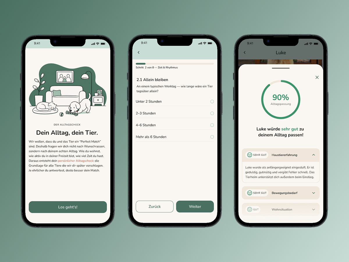
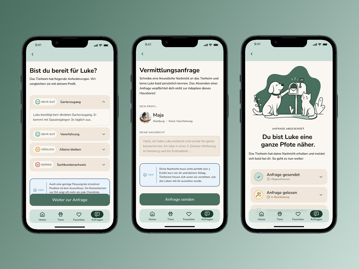
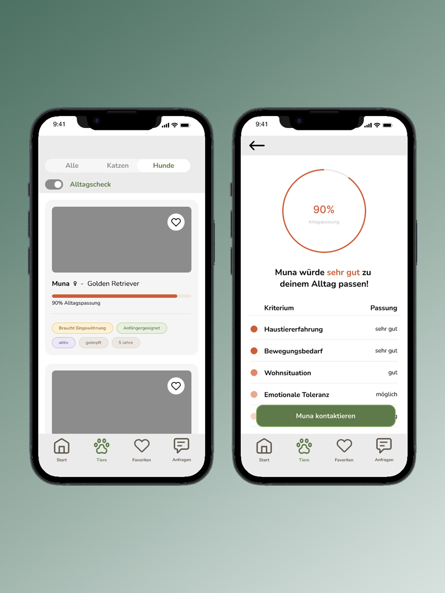
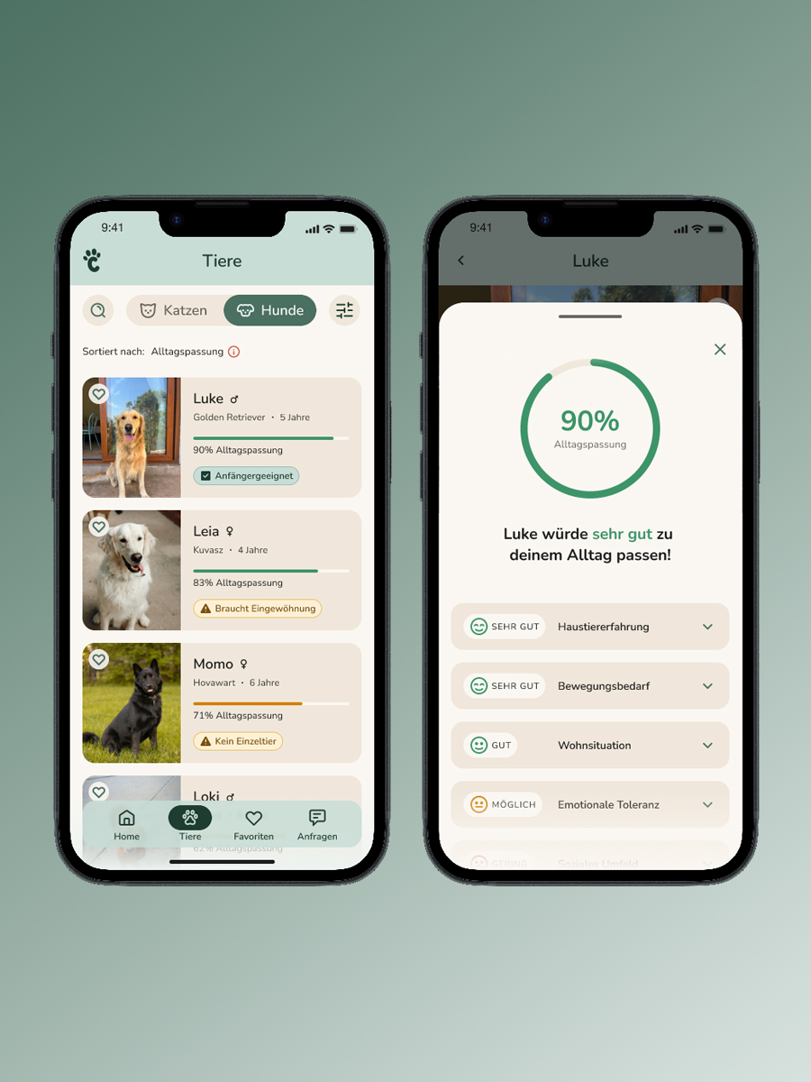
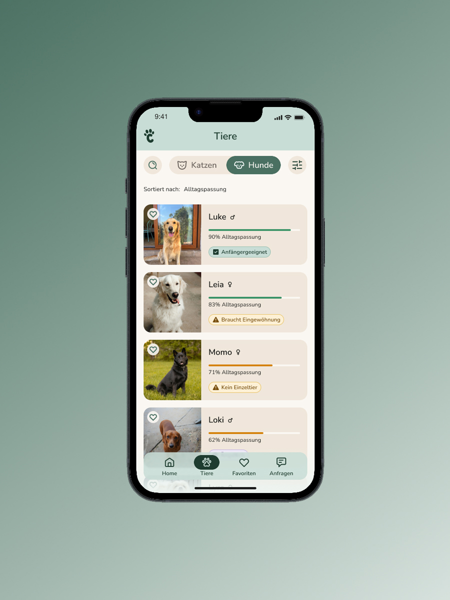
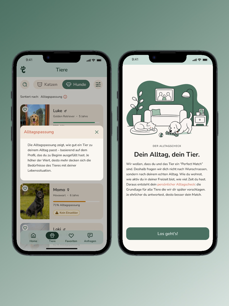
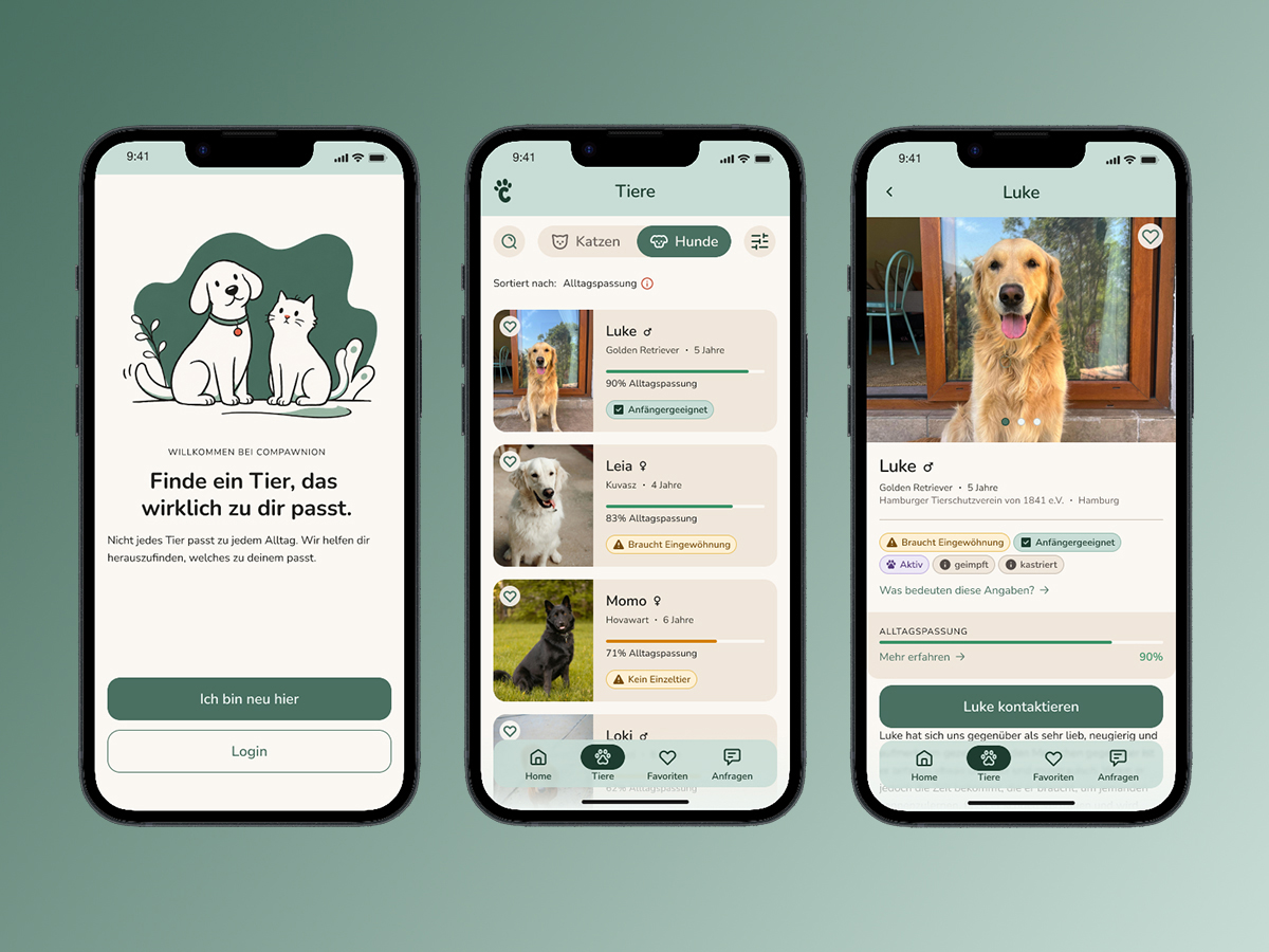
Profile-first instead of browse-first.

The classic marketplace flow shows animals first, and leaves it to the user to figure out whether they’re a good fit. My research showed: the problem isn’t the supply of animals, it’s the lack of self-assessment. Compawnion flips the flow: users define their daily life before they browse animals. This reduces aspirational self-assessment bias and makes matching more honest.

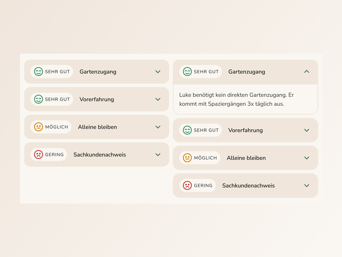
“Profiles saying ‘sweet, friendly, great’ don’t help me. What helps: likes to sleep on the couch, needs a moment in the morning, goes crazy when someone rings the doorbell.”
Interview, first-time adopter
“It would help to have access to good information that isn’t just buzzwords but can actually be matched against my daily life.”
Survey, first-time adopter

First-time adopters as the primary target.

Compawnion serves anyone looking to adopt, but I designed for the user where the problem is most acute: the first-time adopter who wants to do everything right, overthinks every step, and abandons the process before making first contact. This user type is the hardest to serve, and the most underserved.

The Situations-Check as a contact anxiety intervention.

A ‘Send inquiry’ button isn’t enough. The critical moment isn’t choosing the right animal, it’s the transition from observer to applicant. My interviews showed how emotionally charged this moment is.

A solution that prepares the user for first contact in a structured way is needed: what to expect, what the shelter expects, what they can say. When they hit ‘Send,’ they feel like they are already decided.

“I always feared they would categorically reject me as a pet owner because of my living situation in a shared flat.”
Interview, first-time adopter

User side first, systemic question openly named.

Matching quality depends directly on data quality from the shelter side. I decided to build the user side first, because that’s the part that can be validated, and because a working user flow is the prerequisite for bringing shelters on board as partners.

This isn’t a forgotten problem. It’s the next step.

Designing for Maja, the first-time adopter.

Compawnion serves anyone looking to adopt — but every design decision was made for one specific user. Maja represents the user where the problem is sharpest: analytically minded, risk-averse, and stuck before she’s even started. She doesn’t lack motivation. She lacks a framework for making a decision she can trust.

She was the right design filter because she represents the hardest case: informed, motivated, and still unable to take the first step. If Compawnion works for Maja, it works.

  • Risk-averse: “I don’t want to make any mistakes.”
  • Obstacles delay or even halt her decisions.
  • Fear of misjudging the animal’s daily life.
  • Overwhelmed by scattered or contradictory information.
  • Often doesn’t know what to make of the information.
  • A clear assessment of the fit.
  • Transparent and comparable animal profiles.
  • Practical advice for everyday life.
  • A stress-free and transparent process.

Two moments where adoption regularly breaks down.
Two interventions.

Compawnion is a decision support tool. It helps (first-time) adopters discover animals that genuinely fit their daily life, rather than browsing and hoping for the best. The goal is not to overwhelm with options, but to build the structure and confidence users need to take the next step with clarity.

View interactive prototype

Choosing the right animal, the Alltagscheck.

The Alltagscheck questionnaire captures the relevant dimensions of Maja's daily life. The answers feed directly into the matching logic: each animal in the list shows an Alltagspassung score. Tapping it reveals a breakdown by dimension, showing how well the animal's needs align with Maja's profile. The number is not a verdict. It's an invitation to look closer.

Alltagscheck flow, placeholder image

Making contact, the Situations-Check.

Before reaching the contact form, Maja sees a structured overview of how her profile compares to the shelter's requirements. A low score on individual criteria is not a dealbreaker — a tip reminds her that meeting in person often reveals more than any checklist. Once sent, a confirmation screen shows clear next steps, giving Maja visibility into what happens next and reducing the uncertainty that follows first contact.

Situations-Check, placeholder image

A visual system built around calm confidence.

The design target emotion for Compawnion is not excitement — it's calm confidence. Every visual decision reinforces that: a warm but unsentimental palette, rounded but structured type, and a matching system that communicates clearly without overwhelming.

Logo and mark, placeholder image

Logo

The Compawnion wordmark uses Knicknack, a rounded display typeface that balances approachability with clarity. The rounded forms signal warmth and accessibility — appropriate for a product that addresses anxiety and uncertainty. The name itself is a portmanteau of 'companion' and 'paw'. The wordmark needed to carry that playfulness without tipping into the generic visual language of pet product brands.

Typography specimen, placeholder image

Typography

The type system uses a single superfamily: Nunito for display and headings, Nunito Sans for UI text and body copy. The consistent skeleton across both cuts creates visual coherence while the distinction between rounded display and the slightly more neutral sans maintains hierarchy. The typeface feels at home in a product that is designed to feel approachable, not clinical.

Color palette, placeholder image

Colors

The palette is built around three decisions: a primary that signals trust without coldness, an accent that creates energy without alarm, and a neutral foundation that keeps the interface from feeling clinical.

Illustration style, placeholder image

Illustration

Illustrations in Compawnion serve a specific function: they humanize moments of uncertainty. The illustration style is deliberately simple: flat, line-based, with limited color drawn from the product palette.

Copy examples, placeholder image

Copy

Direct, warm, without lecturing. Short sentences that meet Maja where she is, not where she should be. No pressure, no promises that are too big. Compawnion's copy follows one underlying approach: encouragement through honesty, not through optimism.

The concept was understood.
The details needed work.

Visual design, color palette, and information density were consistently praised. The traffic light system for daily life compatibility was understood and not perceived as discouraging. The favorites function was used intuitively as expected.

‘Alltagspassung’ not spontaneously understood: Hypothesis: onboarding (which wasn't finished yet at the time of testing) will establish it in-flow. Recent feedback seems to confirm this.
‘Alltagspassung’ needs further explanation: An overlay was added animal list screen (first encounter with the term after onboarding).
Unexpected clicks: Users interacted with some elements differently than expected or had difficulty doing so. Many of these issues were resolved by adjusting or expanding the touch area.
Confusing CTAs: The copy caused confusion: Is the message intended for the animal or the animal shelter? The solution: The CTA now explicitly refers to the animal shelter at key points.
Missing metadata: Age missing in the animal list, size in the animal profile. Both added.
Before iteration screen, placeholder image
After iteration screen, placeholder image

Using AI to ‘learn slower’.

I used AI tools deliberately, with the goal of understanding the design process itself, not accelerating it. Where I used AI, it was as a thinking partner, not an execution tool.

I used Claude throughout as a sparring partner: to structure research material and data, to iterate on question and answer formats in the Alltagscheck, and for the writing process behind this portfolio page. Suggesting formulations, reasoning through them, discarding them, the final decision was always mine.

I used Figma Make, Lovable and Claude Design selectively for individual screens, to quickly generate and compare variants, as a tool for decision-making, not for design.

I used ChatGPT to generate placeholder illustrations for key screens and flows. These are intentional stand-ins , the final product would use proper vector-based illustrations.

The deliberate restraint had a reason: I wanted to make decisions myself, make my own mistakes, and actually learn. It’s slower. But it gave me a much better understanding of why a design works, not just whether it does.

AI in the design process, placeholder image

What I’d do differently,
and what remains open.

The concept is stronger than the product without a system partner.

Compawnion works only as well as the data it receives. The user side is built, but without structured animal profiles from shelters, matching remains a hypothesis. This was a deliberate scope decision, not an oversight.

Terminology is conceptual work, not microcopy.

‘Alltagspassung’ was not spontaneously understood by any test participant. That’s not a wording problem, it shows that a new concept needs onboarding, not just a better label. Whether ‘matching’ would be clearer was discussed, but the term carries too strong a dating connotation. The hypothesis that onboarding will carry the term remains to be tested.

Research was strong early. Testing earlier would have been stronger.

The conceptual foundation was well-supported by survey and interview data. What I’d do differently: earlier testing sessions with an unfinished prototype. I waited too long for the product to feel ‘test-ready’, rough, early tests would likely have been more revealing than later ones with a polished mid-fi.